That Hurts My Wallet
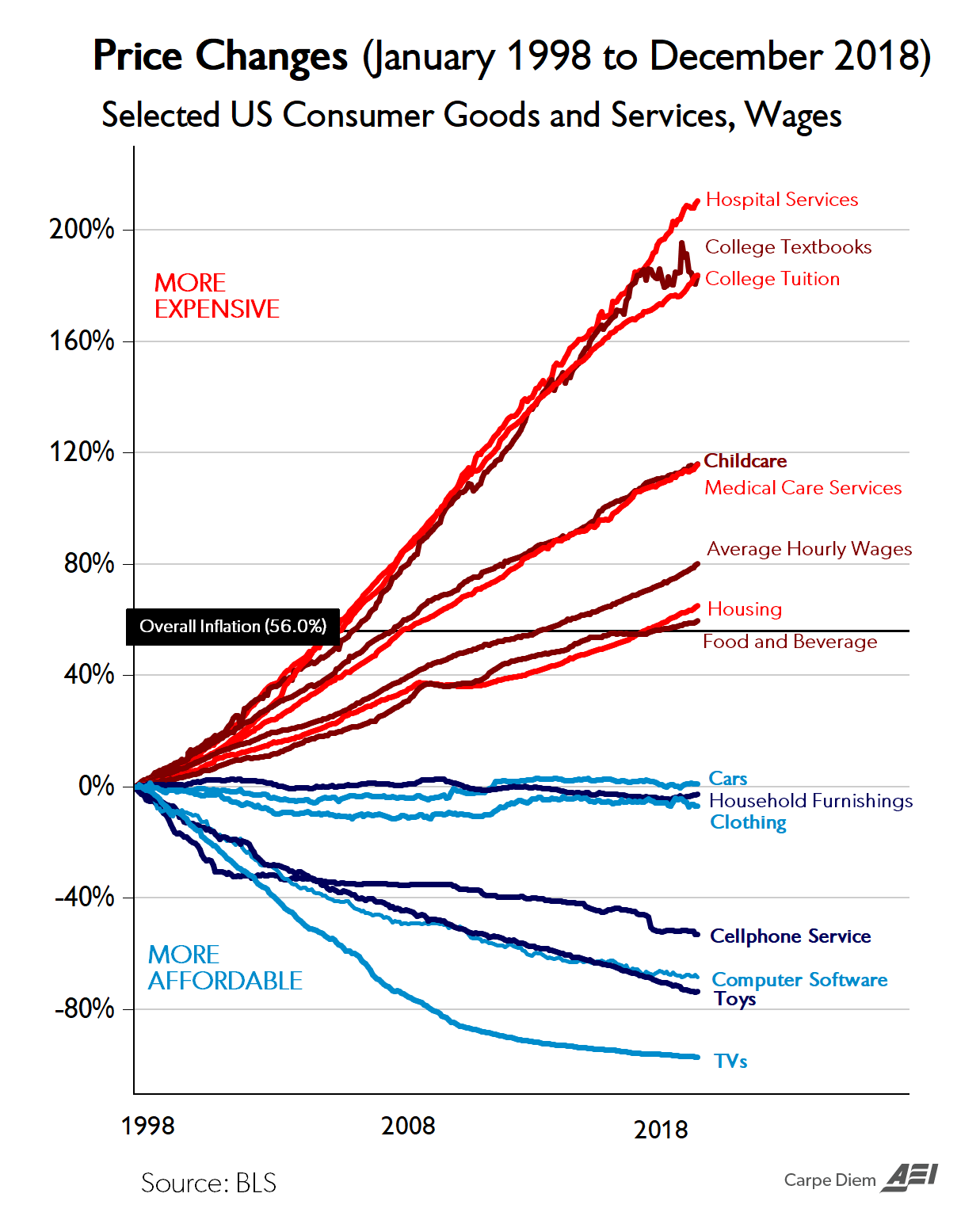
Economist Mark Perry (@Mark_J_Perry) shared an updated chart of consummer prices that may just blow you mind. He used data from the most recent Bureau of Labor Statistics (BLS) report for Consumer CPI prices, through December to update a chart tha the published previously. This version covered the two decades beginning in 1998 and ending in 2018.
I first saw this chart on Kottke.org here: Cheap TVs and Exorbitant Educaiton, Modern America in One Chart. The source for your ariticle can be found here: Chart of The day .... or century?.
I am not doing to say much about this ... just study it, and be freaked out and amazed. Here it is:
~ Rick
Check out my vlog, which includes more of my photography and videography: tales.photos (on YouTube). Remember to like, comment and subscribe!
My photo blog can be found at tales.photos.
©2019 Rick Cartwright